This poll shows that the design for title block 2 is most popular. Title block two had a red background with the start of the letter in black and slowly fading down to white. Although this design was most popular I did not use the design in my final magazine front cover. For my final title block design I used black bold capitalised font. The style was shattered connoting the rock music shattering the title.
This blog is for my AS Media Course, where I will post the journey to creating my own music magazine. Enjoy :)
Monday, 21 October 2013
Thursday, 17 October 2013
Potential title block designs
Which Title Block best suits a Rock Music Magazine?
This post consist of potential title block designs for my music magazine 'Unplugged'.
The genre of my magazine is rock which one of the four title blocks do you
think suits my magazine best?
Monday, 14 October 2013
Title Block Analysis
Looking at the title block I can tell that the genre of the music
magazine is rock. This is because of the cracks in the word, which connotes the
loud heavy music produced by rock artists. As well as the color used; black.
The use of the color black suggests secrecy and mystery. As well as that it is
a stereotype that rock artists prefer black. The word ‘Kerrang!’ is written in
bold capital letters with an exclamation mark at the end; this connotes
strength and power, which the music generally gives out.
Looking at the title block I can tell that the genre of the
magazine is pop. This is because the use of one letter that pops out at you,
when I look at the magazine my eye directly goes to the ‘Q’. The colours used
are red and white which connotes passion and perfection.
Looking at the title block I can tell that the genre of the music
magazine is rock. This is from general knowledge of the actual rock band
‘Rolling Stones’ which the magazine is owned by. The colour used is red which
connotes danger and passion of rock music. The font used is fancy; this is to
attract high income readers to buy their magazine. The use of fancy writing
connotes that the magazine is high status and fancy.
Thursday, 10 October 2013
Monday, 7 October 2013
Star image analysis
The Evolution of Britney Spears
This image has been framed to give a sex appeal to the
audience. This will attract males to the magazine making them buy it because of
the half naked celebrity at the front. The camera shot used is a medium shot,
showing from her top half to her knees.
The costume of the celebrity icon is very appealing. This is because she is wearing pink spotty briefs with a black bra and a white school shirt, giving out a sexual appeal. This would appeal to mostly male’s but on the other hand it could also appeal to females. This is because some females may feel conscious about their own body, making them look up to the iconic image.
Props have also been used to complete the whole ‘sexy’ look. For example she has a pink phone in her hand which denotes she’s on the phone, but this could also connotes that she is sweet with her words. On top of that she has a purple teletubbie’s bear in her hand showing that she is playful. Another prop used to give a sexual appeal is the pink phone. She is talking into the pink phone while at the same time staring directly at the camera making it a direct mode of address.
The setting of this image is on a bed with silky pink bed sheets. This connotes a sexual image to the audience. The overall image, setting and props gives her a child like yet mature look – making her appear even more sexually attractive to the target audience of men.
The colors used are different shades of pink and purple and black. The soft light pink complements her shorts while the black bra complements the black dots on the shorts. The dark pink on the silky sheets makes her body stand out more, making her more important. The purple is used for the bear.
The setting of this issue is in a tight space between two walls. This is to make her look small and vulnerable to the reader. The text is written to fit around her perfectly curved body, drawing more attention to her perfectly tanned small body shape. This connotes a deep sexual image to the audience.
The lighting used is very bright, with mostly white surrounding her – representing purity and vulnerability. The colors used are simple purple, suggesting creativity and immaturity. The use of red suggests passion and danger to the reader. Black is also used; this suggests mystery and secrecy to the reader.
The camera shot used in this image is a
close up. The use of a close up sho makes it a direct mode of address. The
black and out effect is significant as they want to present her as a grown
mature woman compared to how they usually portray her as; young and immature.
The colour also suggests a cheerless story.
Thursday, 3 October 2013
Focus group and response video
I chose a group of four teenagers who fit my target audience. I
presented them with my brainstorm of ideas on what my music magazine would be
about. Overall the response of the group towards my ideas was very positive.
They agreed with the choices that I made for example the contents of the
magazine, the name, the release dates and the price.
Tuesday, 1 October 2013
Audience questionnaire and results
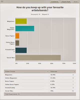
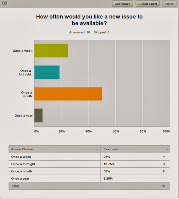
This is a questionnaire I created to find out people's thoughts of magazines. My aim was to question my target audience of young people in order to find what type of magazine would be suitable for my target audience.
In this
question I found that the most suggested name for my magazine is Unplugged.
Subscribe to:
Comments (Atom)


