Monday 30 September 2013

Initial magazine plan

The target audience for my music magazine is teenagers and young adults. 

The style/genre of my magazine will be rock. This is because around this age a lot of teenagers and young adults are experimenting with different types of music genres, and my magazine will inform people of the genre, which could also persuade some people into becoming a regular costumer for the magazine.

My magazine will be release once a month; this would allow me to make my price high as the magazine would be released once a month making it affordable for my target audience as well as profitable for my magazine.

My magazine will cost between £3 and £4. This is because the magazine will be released once a month therefore placing it around this price would ensure that the magazine profits as well as the target audience being able to afford our magazine at least once a month.

My magazine will be glossy so that it does not damage easily like paper. This will also benefit fans who would like to keep the magazine because their favorite band or artist is on the front cover.

Thursday 26 September 2013

Institutional research

During this course I researched distribution companies. I found this research very helpful as I gained an insight on how marketing m


This website Bauer produces both mainstream magazines such as Mojo and Empire as well as niche magazines such as Practical Classics and Photo Answers.The total readers for Kerrang is 345000, of this total 55% are male and 45% are female, 56% of this amount are aged between 15 and 24. 51% of Kerrang’s readers are within the ABC1 class. Q Magazine has around 377000 readers and of that total 68% is male and 32% are female with 70% of the readers in the ABC1 class. 35% of this total is aged between 15 and 24. Mojo magazine has a total of 220000 readers: 73% of this is male and 27% of this is female. 59% of them are in the ABC1 class, 29% of the total readers are between the ages of 45 and 54. The brand is briefed to develop a visual identity and brand property to extend their existing logotype. Bauer is known as ‘the heroes of communication. It is a business to business device that can be tailored by division, brand and genre depending on the audience.


This website mainly produces niche magazines such as Chat, Decante and Essentials.
The magazine Chat is released once a week and is targeted to mums and housewives around the age of 43 at a reasonable price of 86p. On the other hand Decanter is released monthly at £4.20. The magazine targets adults within the ABC1 social classes; the average age that buys the magazine is around 51. This distribution site also advertises digital editions such as on the apple store or on kindle fire. 

This website mainly produces niche magazines such as Delicious and Focus. The average age Delicious magazine is aimed at is women aged 44 in the social groups of ABC1 and ABC. There is also an 88% purchase rate showing its popularity with this age group. The magazine is also distributed on different social classes such as face book and twitter, the magazine also has its own website with 496K unique users. Focus on the other hand is aimed at Male’s aged 40 in the social groups ABC1 and AB. The total male readers are 82% with 66% of them in the social group of ABC1. There are 55% subscribers to the magazine and a 95% purchase rate. 

Monday 23 September 2013

Analysis of article


The double page spread article starts on page 58 in this week’s mixmag issue. She is a DJ and an electronic dancer, therefore making her fit the genre of the magazine. The first page shows two colourful medium shot images of Maya Jane Coles at different point of views. The second has text on the left page with a black and white medium shot of her on the right page. The third page has more text and small secondary images around the page. The fourth page has an equal amount of texts and images. The colour that is used constantly throughout the double page spread is black, making the reader want to read the article as it suggests secrecy and mystery behind Maya Jane.

          The choice of artist featured in the double page spread article suggests that the target audience will be party (club) goers, aged 18 to 26. I know this because the music magazine is aimed for that sort of audience and because she is a DJ and an electronic dancer, suggesting that she performs at clubs. The language used in the article is very descriptive, giving the audience an outlook on Maya Jane Coles life. The writer made sure to include petty information about the artist such as the type of make-up she had been wearing during the interview. This is to build a close relationship between the reader and the artist, making the reader feel as though they know the artist very well.

The artists costume heavily features the colours red a colour that connotes energy. This is very effective as she is a DJ and a dancer presenting her never ending love and energy for what she loves. The costume has been chosen carefully to reflect her passion for her chosen career. Colour has been used to attract the audience’s eye as they flip through the pages. All four double pages have one colour scheme: red, black and white. Each colour gives a different meaning to the audience. The pages are dominated with the colours black and white. Black has been used as the background to make the white text and images stand out.
          The tone the magazine uses when addressing the audience is neutral as if they are close friends with the audience as well as being a very informed intelligent fan. This is a great way to approach the target audience as it makes the audience feel as they were verbally listening to the article writer. The tone also works if the audience that is reading it is a regular mixmag buyer. 

Thursday 19 September 2013

Analysis of contents page


This image is the contents page of ‘mixmag’ magazine. The magazine uses one image which is placed in the centre to the left. The image is of two teenagers obviously having a great time a club. This image was used because it has a relation to the genre of the magazine which is dance and clubbing music. This also supports the target audience of the magazine. This is shown through the age of the two females enjoying themselves at a club. 

                The skyline runs across the top of the page. The skyline displays the name of the magazine in the left corner, the month and year of the issue in the middle and ‘contents’ in the right corner, to instruct the reader that this is the contents page. The skyline uses all different fonts, which is primarily used to add creativity to make the page more appealing to the target audience. The colours used are black and white. Black was used for the background and white for the text.

                The information is organised so that it is accessible for the audience. For example the cue for the magazine is put to the right side of the page next to the main image in a column. As well as that the title of the cue is in a bold capitalised font with a smaller lower case line of information about the page below.

                On the mixmag contents page there are a total of three sections. Section one has one main image of two young people enjoying life, which support the genre of the magazine. In section two there is a list of page numbers and what articles you would find on those pages. This would become very useful to the target audience because then it is an easier way to navigate through the magazine. In the last section of the magazine is a description of the cover mount – ‘Your Free CD: Maya Jane Cole’. In this section the magazine tells the audience a little about the artist making them want to carry on reading with the double paged articles of her on page 58. Alongside it the magazine has provided the reader a list of the songs that are featured on the album and between the two texts there is a small image of the album cover itself. This is tells me that mixmag likes to make reading their magazine very easy so that it can fit in with a very busy party goer. The cover mount and the double page article on Maya Jane Cole could also be seen as a promotional feature.

                The magazine’s logo ‘mixmag’ is placed at the top of the page in left corner beside the month and year the issue was released. The logo is very small compared to the front cover, the word ‘contents’ dominates the logo in this page. The magazine has other franchises such as a television channel and a website but they are not promoted on this page.

Monday 16 September 2013

Analysis of front cover II


The second magazine I chose to analyse is ‘mixmag’. From the front cover you can tell that the genre of the magazine is dance music, therefore articles that would be included in this magazine would be based on dance music (club music).

Magazines use colours in their magazines, this is because colours are a use of non-verbal communication; its meaning can change from one day to the next depending on the individual. Mixmag uses simple yet effective colours such as red, black, white and brown. The use of the colour red suggests passion; it shows the target audience that ‘Maya’ has passion for dance and music. In my opinion I find the colour scheme very successful. The design of the masthead at the top of the magazine is very simple. The use of a bold lowercase font is very successful as it associates with the genre of the music magazine; which is dance music. I think this because the font itself is smooth just the way dance should be.

The central image of the magazine is Maya Jane Cole, who is ‘the underground’s biggest star’. The central image has been constructed to have a direct mode of address. This also tells the buyer that they want a personal relationship with them. For example the magazine wants a strong relationship with outgoing clubbers. The target audience for this magazine is clubbers but, mainly Maya Jane fans. This would mainly attract University students 18+ that enjoy clubbing.

The anchorage text says ‘The dark and mysterious world of the undergrounds biggest star’. This suggests to the audience that the article would reveal the ‘dark and mysterious world’ of the ‘underworlds biggest star’ Maya Jane. This would then make the audience want to buy the article as they would like to know more about her, especially if they are friends. The use of buzz words in magazines is to attract the audience’s attention. For example ‘mixmag’ uses the buzz word ‘Plus’. This would attract other fan groups other than ‘Maya Jane’. For example fan groups that belong to ‘Jessy Lanza’ and ‘Gorgon City’.

The magazine also uses a sky line to attract their audience. ‘The world’s biggest dance and clubbing magazine’ this will attract their audience because the buyer would see that ‘mixmag’ is the ‘biggest dance and clubbing’ magazine making them want to buy it to be a part of something that big.


Analysis of front cover


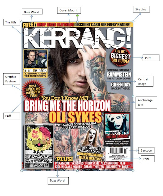
The magazine I chose to analyse is ‘Kerrang’. From the front cover you can tell that the genre of the magazine is rock, therefore the articles that would be included in this magazine would be based on rock artists.  

Magazines use colours in their magazines. This is because colours are a use of non-verbal communication; its meaning can change from one day to the next with any individual. Kerrang uses colours such as red, white yellow and black to attract their audience. For example the use of the colour red suggests passion; this could attract a passionate audience. The use of the colour white suggest perfection, it connotes that the magazine is perfect for the audience; giving it a more personal effect. On the other hand the colour yellow suggests optimism. The colour black on the other hand is not used as much but when it is used it is used perfectly. For example on the puff ‘Most revealing interview ever’, the colour black itself suggests secrecy a mystery, therefore using it behind this puff would make the reader want to buy it so they too can be ‘in on the secret’

The design of the title block ‘Kerrang’ tells me that the magazine is about rock music. I know this because the title block has cracks in the letters suggesting that the music (rock music) is loud enough to crack glass. The title block also gives the impression that their magazine goes ‘all out’ just like the rock artists/bands that will be featured inside the magazine.

The central image of the magazine is Oliver Sykes who is the leader of the rock band ‘Bring Me the Horizon’ (BMTH). The central image has been constructed to have a direct mode of address. This also tells the buyer that they want a personal relationship with them. For example the Central image suggest that it wants a relationship with BMTH fans but mainly the sub-fan group i.e. the Oli Sykes fan group.
               
The target audience for this magazine is BMTH fans. This would mainly attract teenagers 15+. The magazine also presents that the target audience’s interests are tattoos as well as rock music. This is shown through the central image of Oli Sykes.

The anchorage text says ‘“You Don’t Know ME!” ‘BRING ME THE HORIZON’ ‘OLI SYKES’ ‘Rocks most controversial star bares his soul’. This suggests to the audience that the issue would include behind the scenes with Oli Sykes, where he would tell ‘Kerrang’ more about himself.

The uses of buzz words in magazines are to attract the audience’s attention. For example ‘Kerrang’ uses ‘FREE’ as a buzz word to attract the target audience making them read the following ‘Drop Death Clothing discount card for every reader’. This will then make the target audience (Oli fan group) want to buy the magazine because his clothing line is giving out free discount cards. In addition ‘Kerrang’ uses another buzz word ‘PLUS’ to attract other audiences. This would then attract Paramore, Skindred, Fightstar, Alexisonfire, FFAF, Kids In Glass Houses, Dream Theatre, Architects and Fact fan groups. This would then result to ‘Kerrang’ selling a lot of magazines.

 The magazine also uses puffs. This is also used to attract audiences to the magazine. For example ‘Kerrang’ uses puffs to tell the audience what other exclusives they have inside the magazine. ‘The UK’s Biggest Gig Guide’ would attract an older target audience because they are older and have more freedom to go to gigs whenever they want, so an older audience may buy the magazine for the ‘gig guide’.

Thursday 12 September 2013

Conventions of a Music Magazine Cover


This is my magazine cover analysis. Researching the conventions of a magazine will aide me in understanding the conventions needed on my front cover in order for the magazine to look professional. Graphic features, puffs and buzz words are used to attract the audience. With these features you include aspects that would persuade a reader to buy the magazine; for example 'BIGGEST' is a buzz word that is used to make the reader buy the magazine so that they could know the biggest gossip that is circulating at the moment. 

Tuesday 10 September 2013

Preliminary Task


This is my College Magazine cover. The name of my magazine is 'C-News'. The image is a medium shot of a college student sitting in front of a computer. I constructed this front cover on Photoshop by adding the text on the side using different layers and the T tool (text tool). I changed the color of the text to white so that it was different to the title C-News. This is also because the color black would have blended in with the students shirt. 

This is my contents page for my magazine. The secondary images used are medium shots of other students at the College. The contents page will be used to guide the readers through the magazine. I constructed my contents page on Photoshop using the re-seizing and rotation tool for the images and the pencil. The page numbers are placed directly beside each article title so that the reader would find it easier to locate. The page number is on the bottom right hand corner with a pencil behind it. The pencil represents the idea of a college magazine where as the number is to show the reader the current page they are on so that when they are searching for a specific page it is easier to locate.

Monday 9 September 2013

Introduction

Hi my name is Hafsah Jalloh and this blog is dedicated to my A Level Media Course. Through this blog I aim to take you on a journey, on how to create a magazine that looks professional and attractive to a certain target audience. This blog will include posts such as my research in to magazines and their distributors as well as my first draft down to my final draft of my front cover, contents page and article followed by improvements suggested by my peers.

Thank You.